Rakuten Advertising • June 2021 – August 2021
Offer management
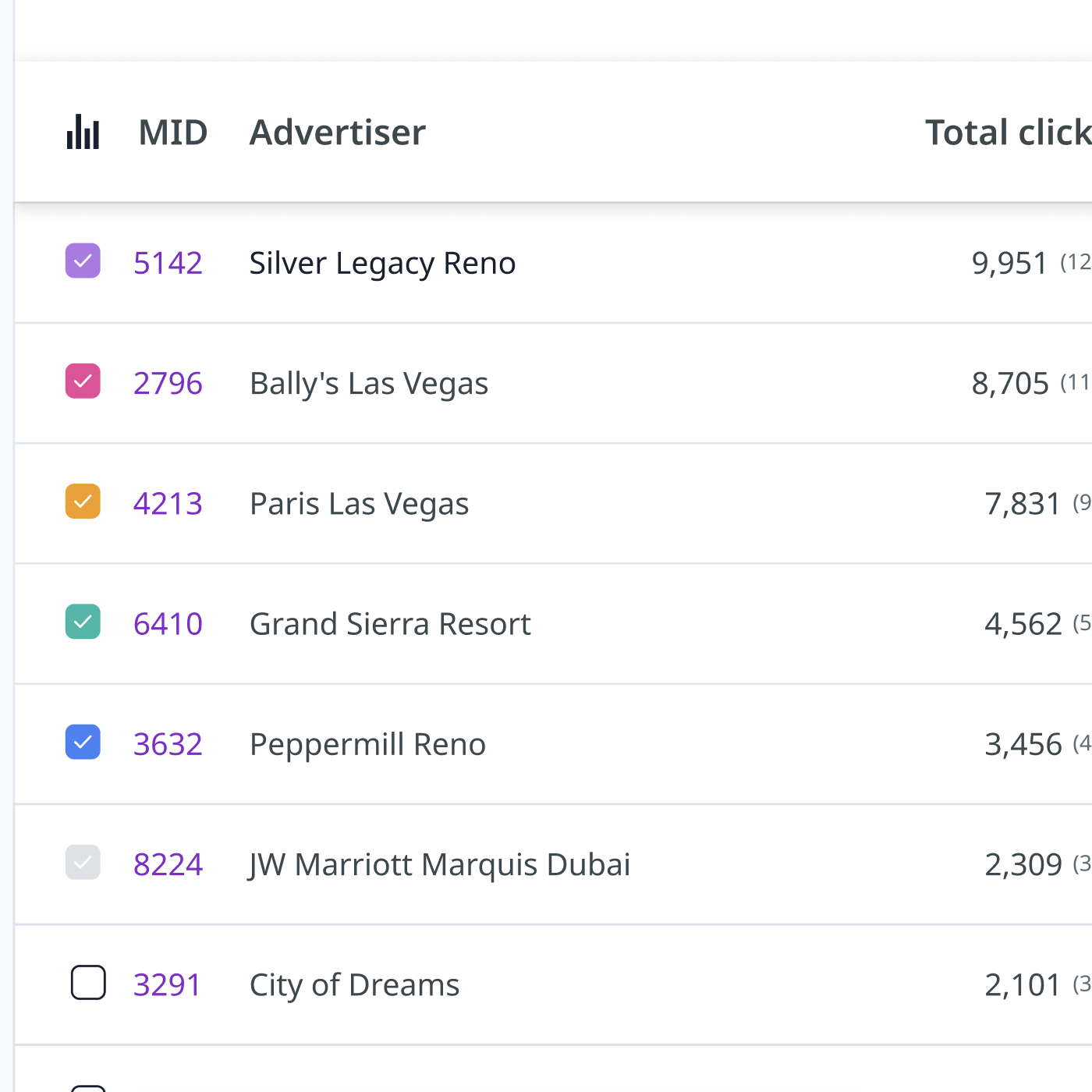
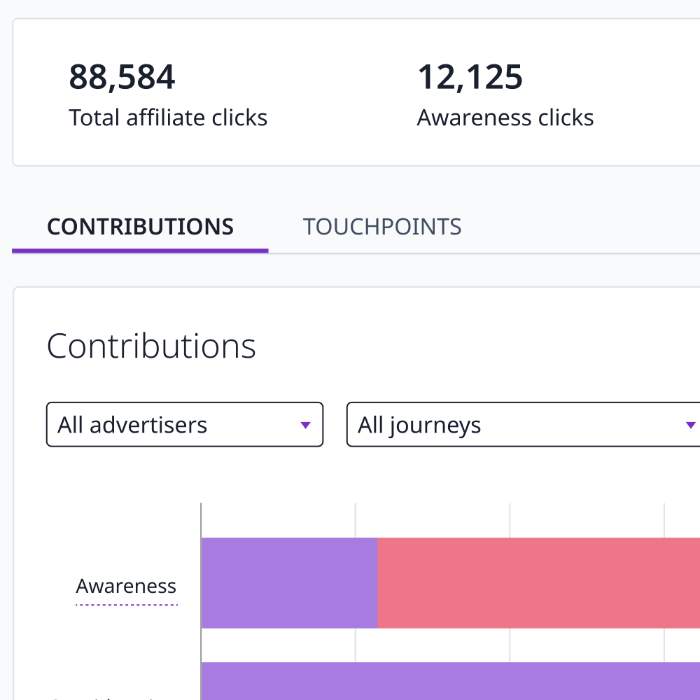
Rakuten Advertising's offer management dashboard lets publishers view, compare and accept affiliate offers from advertisers. It hadn't been touched in years — the UI was cluttered, the terminology was unclear, and users were avoiding it rather than working with it.
Role: Sole UX designer
Skills: UX/UI, Research, Prototyping, User testing
Challenge / Problem
Managing offers is a cumbersome task, it involves multiple pages and unclear terminology that deters users from exploring options. The dashboard has also been neglected for many years and is in need of a UI overhaul.
Discovery
Before sketching anything, I wanted to understand exactly how the existing flow worked. I mapped it out in Miro using screenshots from the legacy dashboard — this gave me a clear picture of what was there and where the friction points were. But I wasn't going to assume I had the full story without talking to people first.

Gaining insight
I went ahead and captured some qualitative data. To do this I created a small survey within a google form (click the image to view) to distribute amongst the account management teams to help gather a better understanding of how they interacted with this feature, it was also a chance for me to understand known pain points that the team have been presented with. The reason I chose the account managers was due to the level of exposure they have to both the platform and the end users.
Once I had responses collated I created an affinity diagram to group and prioritise what I'd heard. I also followed up with several participants directly — partly to clarify anything ambiguous, partly because talking to people fills in the gaps that survey answers never quite do.

Goals
Using survey data I was able to identify three main goals to focus on:
Comparison
If I am presented with a new offer invitation I want to be able to compare it to my current offer.
Discovery
There was no consistent answer to how a user would find a new offer invitation. Can I make a consistent point of discovery?
Partnership status
The current UI does not offer any indication of partnership status. A user wants to know if a partnership already exists.
Solution
Redesign how publishers manage affiliate offers within the Rakuten Advertising dashboard — making the flow cleaner and easier to use, so publishers actually engage with it rather than avoid it.
Planning
I started with a flowchart mapping the routes a user might take to accept an offer request, then ran it past people in user-facing teams to check nothing was missing.

Sketching
Once happy with the flow I opened my notepad and began sketching some initial ideas. At this stage I scribble a lot of ideas down both illustrated and in note form, it can look like a mess but I find it helps to get all my initial ideas on paper and then quickly eliminate ideas or come back to them at a later date if needed. As I develop an idea I start to sketch it into something of higher quality to allow me to easily translate it to a digital wireframe when the time comes.

Prototypes
Rather than testing from sketches, I built simple wireframes in Sketch first and ran them with candidates over Zoom. I gave them a set of tasks to complete and watched where they got stuck. That first round told me users wanted a dedicated landing page for offer invitations alongside the notification system — something I hadn't fully anticipated.

I gradually increased the fidelity across rounds, eventually mapping the mockups into an interactive prototype in Sketch. The more linear flow gave candidates something closer to the real experience and produced much more useful feedback than static screens alone.

User testing
Testing surfaced a few things that needed fixing — mainly how functionality was communicated and making offers easier to compare side by side. I iterated on both before sign-off.

Outcome
Since the updated flow launched, support tickets around offer management have dropped, and account managers have reported fewer queries from publishers on this area. That freed them up to focus on users' actual needs rather than walking people through a confusing interface.
I still monitor usage through FullStory and make iterative updates as patterns emerge.

